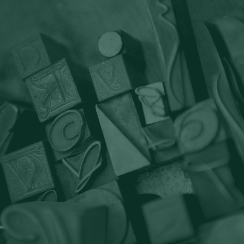
Over the Summer 2022 semester, I was enrolled in two courses for my Graphic Design minor – Intro to Graphic Design and Typography. Both courses taught me a lot and gave me plenty of material to post in future blogs and Instagram posts, but this project was so huge it deserves a blog of its own.
In my Typography course, we had a large project called “Type in the Wild”. This project spanned the entire summer and involved us finding one example of good and bad typography every week for ten weeks. We then had to write a short paragraph explaining what made the design strong or poor using terminology from our coursework.
This exercise was eye-opening for someone that has never stopped to consider why we choose the fonts we choose. For example, you probably didn’t know that my website uses Merriweather for everything. Even now that you know, you probably don’t care.
But now I’m the kind of person that cares. I see Helvetica everywhere and it’s honestly starting to drive me (and my family) a little crazy. If I had to lose a bit of my sanity and completely change my view of the world because of this course, then I’m at least going to get something out of it and share my project on my blog.
Throughout the semester, we had to put together a process book showing how we designed our magazine in InDesign including choosing a color scheme, setting up a typeface pairing, and adding our original drafts for our Type in the Wild pairings by week. If you’re interested in seeing the behind-the-scenes process that went into making this project, you can see the PDF of this process book here.
Finally, there was making the actual magazine/eZine/book. Instead of simply putting my writings by week one, two, and so on, I decided to sort my Type in the Wild findings by topic. All of the topics in the book were covered in my course, but not all topics from my course are included in the final project.
The topics discussed include:
- The simple truth about simplicity
- How the history of your font impacts your branding
- Typography is made to be read
- Knowing your medium
- Fickle figure/ground relationships
- The great unity/contrast war
- Corralling your kerning
- Handling your handwriting
- Choosing the right color schemes
- Incorporating graphics into your typography
The images were collected over the summer as I was travelling around the United States. While it is not a large sample size of marketing procedures across the country, I do feature advertisements and signs around Washington D.C., booth features from the Sweet and Salty Show in Chicago, Illinois, menus from small businesses in Pensacola, Florida, and products sold on the shelves of my local Neighborhood Walmart.
You can check out a free copy of “The Good, the Bad, and the Typography” by visiting this link. There, you’ll have access to a free digital copy with turning pages like a typical magazine. As I mentioned before, this was not the only piece I put together as part of this course, let alone the projects I made for my Intro to Graphic Design class. As this blog builds with my portfolio, I hope to share my creative works (and hopefully improvements) with all y’all!
